train tracks


train tracks


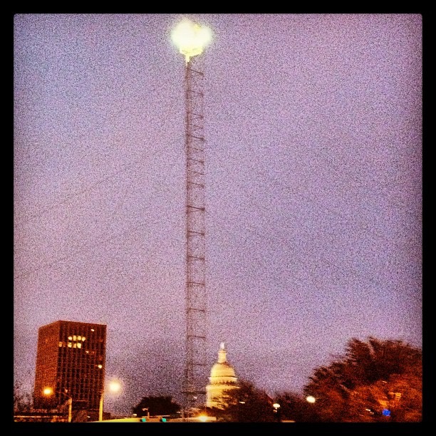
moonlight tower (http://en.wikipedia.org/wiki/Moonlight_tower#Moonlight_towers_in_Austin.2C_Texas)
 Via Quipsologies, an interesting perspective on the advent of more and more people having opinions on logo and brand redesigns: Graphic Design Criticism as a Spectator Sport.
Redesigns such as Tropicana, UPS, and the University of California are used as examples. (Come to think of it, this isn’t all that recent a development; I was at AT&T when Lucent (RIP) was spun off, and their “Innovation Ring” logo was mocked by none other than Dilbert.)
The post gives an interesting, in-depth perspective, and is a reminder that people don’t necessarily love new designs just because they’re new and “better” according to the designers.
I was surprised by how often the civilians [non-designers] got it “wrong,” voting enthusiastically for the cartoony old version of the Comedy Central logo, the needlessly fussy and insecure pre-redesign Starbucks, the dated Clarissa Explains It All-era Nickelodeon splat. After a few hours of air-conditioned anthropological observation, a number of precepts emerged, almost all of which rang as true in my professional experience as in Building 110.
… Third, and most crucially, people prefer the thing they’re used to rather than whatever new thing you’re foisting on them.
This is unfortunately as true for software & user interfaces as it is for logos, though we can make those work better, be faster, do more, etc., in order to make it worthwhile for our users to endure the change.
I also loved this distillation of, well, of a lot of “discussion” on the Internet:
A seemingly endless series of drive-by shootings punctuated by the occasional lynch mob, conducted by anonymous people with the depth of barroom philosophers and the attention span of fruit flies.
As the saying goes: opinions are like assholes; everyone has one. When I first heard about the UC logo, I thought it looked dumb, too (though I was prejudiced by the Daring Fireball post that got me there). But there’s a lot more to it than a simple graphic that “a 4-year-old could have made”. Next time I have that reaction, I’ll remember this “Spectator Sport” post, as well as the UC logo post by Armin Vit he linked to, and think twice.
A logo doesn’t have to be the equivalent of a book trilogy and tell all its story through a circular device. A logo, actually, is nothing. It’s useless. It derives meaning from what it represents. I’ve said this before: The Nike swoosh logo is shit. It’s a clunky checkmark. People think it’s great but it’s not. It’s the amazing athletes and their stories that Nike has associated with over the decades. It’s the quality products. It’s the great ads. It’s not the logo.
… Funny story: You know what Nike founder Phil Knight said when he was presented (and proceeded to select) the swoosh logo? “I don’t love it. But it will grow on me.”
more like con sessions

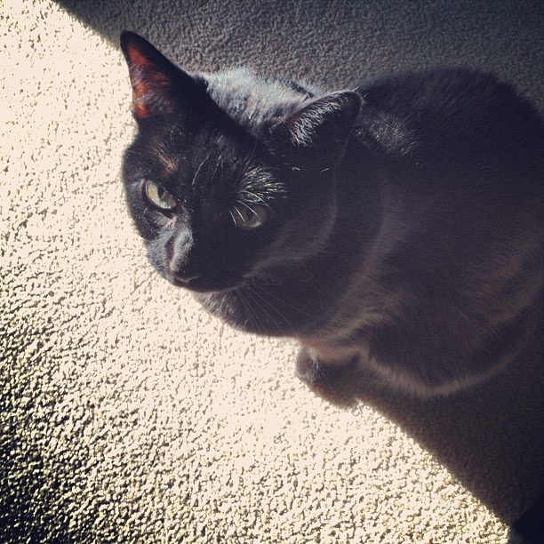
un gato negro
natural grass vs artificial turf, January edition

are those mini Aztec pyramids, at the first Aztex tryout of the season? no? ok, my bad

cat down, repeat: cat down

stare-down with a shadow
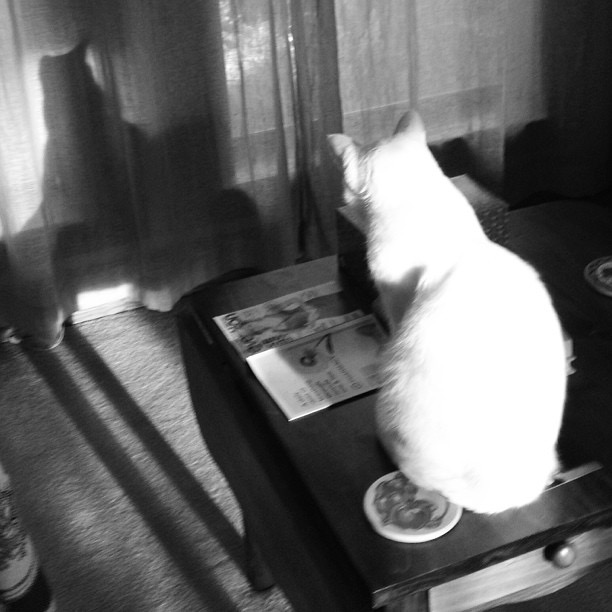
Santa down, repeat: Santa down

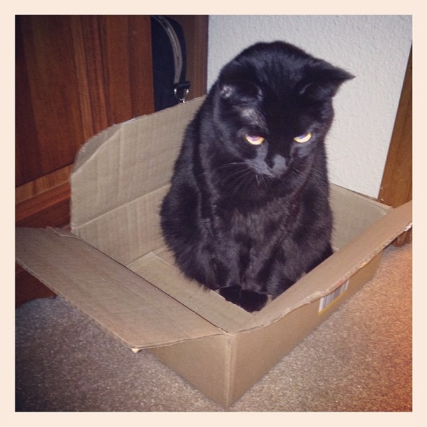
here’s a sad cat in a cardboard box. Merry Christmas.
good morning, giant fireball

4-H bunnehs 4tw

“You go to [tree-decorating] with the [decorations] you have, not the [decorations] you might want or wish to have”

unimpressed deer head: still unimpressed


warnin

an ole anole

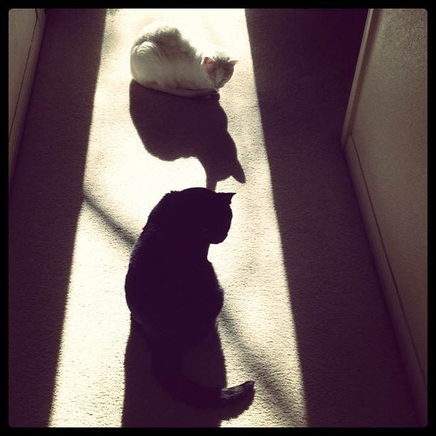
cats & shadows
watching 14 consecutive hours of teenagers getting repeatedly shot to death in Call of Duty Black Ops II: not impressed

I let this sleeping dog lie

butt, er, fly

amber waves, check; purple mountains, not so much

A long time ago — all the way back when people still said “write once, run anywhere” with a straight face — I wrote a simple Java app called Iceberg. It reported on the directory sizes of your disk, and presented a simple UI for poking around to find the big ones.
Although it had a lot of shortcomings, it continued to be a really useful little tool every now and then. Whenever I ran low on disk space, it more often than not helped identify some big, dumb files that were unnecessarily hogging space: old downloads, video files, log files, unused apps, etc. Sometimes I even managed to run it on the remote Unix machines at work, which was often similarly enlightening.
But Java has slowly and steadily lost whatever sheen it once had. From having the Oracle logo on it nowadays to Apple recently removing the plugin from OS X web browsers, its day in the sun has passed (see what I did there?).
Out of the ashes of that goofy little side project app now arises: another goofy little side project app! Meet Iceberg 2 (v.1.9.7). That page gives all the details and usage info necessary, as well as a link to the GitHub repo. The “1.9.7” is a nod to this not quite being finished enough to fully call 2.0 yet. I’m hoping additional use will shake out some issues, and am also hoping to speed it up more.
As you’ll immediately see, I’m accepting from the start that this isn’t going to be a utility for everyone, that it’s a tool for me and my kind:  geeks who use a *nix command line (and who know what “*nix” means). The generator script currently has no Windows support (unless it miraculously works under Cygwin), but if someone wants to contribute a version that works there (Perl? Ruby? Python? .NET.ASP.C# RT Professional.bat?), that would be great.
The generator script works fine on Mac OS X, and also on the handful of Linuxes I’ve tried it on (Ubuntu, RedHat, & CentOS). The HTML files it creates should work fine in any modern browser, on any OS.
If this sounds like something up your alley, check it out and let me know what you think: Iceberg 2.
This anecdote by Marco Arment of happening by a Microsoft store on Surface launch day is snooty and condescending, which makes me feel a little abashed that it resonates so much. On the other hand, I can appreciate how satisfying it is to long-time Apple users for the tables to be to turned on the old monopoly.
But I don’t think many Surface buyers are going to comparison-shop with the iPad, or vice versa. It’s very clear who the Surface is for, and it’s not us.
The Surface is partially for Microsoft’s world of denial: the world in which this store contains no elephants and Microsoft invented the silver store with the glass front and the glowing logo and blue shirts and white lanyards and these table layouts and the modern tablet and its magnetic power cable. In that world, this is a groundbreaking new tablet that you can finally use at work and leave your big creaky plastic Dell laptop behind when you go to the conference room to have a conference call on the starfish phone with all of the wires and dysfunctional communication.
But it’s also for people like that salesman who don’t agree with Apple’s choices: people who want to have more hardware options, more customization, more hackability, and fewer people saying “no” to what they can do on their devices.
Apple’s products say, “You can’t do that because we think it would suck.” Microsoft’s products say, “We’ll let you try to do anything on anything if you really want to, even if it sucks.”
That last bit is especially pertinent to me, with regard to design and feature decisions we’re making at work. Though all of us there admire and wish to emulate that spirit of Apple’s products, I think we have to admit that for our products, in our market, with our users, we’ll never be able to be that strict. (Of course, we’ll do our best to minimize the “even if it sucks” part.)
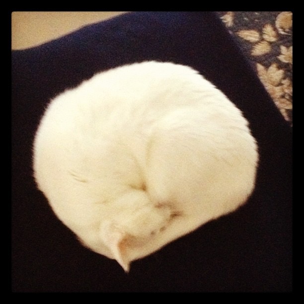
the proper response to a cold front: hibernation
great group banner, or greatest group banner? #aclfest

Zola #aclfest

Los Campesinos! You! Me! Dancing! #ACLfest

this grass rejects your boundaries. this grass will not be held back. this grass is going for it. this grass knows: #yolo

Powered by WordPress & Theme by Anders Norén