Category: design

The Correct Vision of the Web

I absolutely loved this written version of Maciej Cegłowski’s talk from last year, Web Design: The First 100 Years.

I think it’s time to ask ourselves a very designy question: “What is the web actually for?”

I will argue that there are three competing visions of the web right now. The one we settle on will determine whether the idiosyncratic, fun Internet of today can survive.

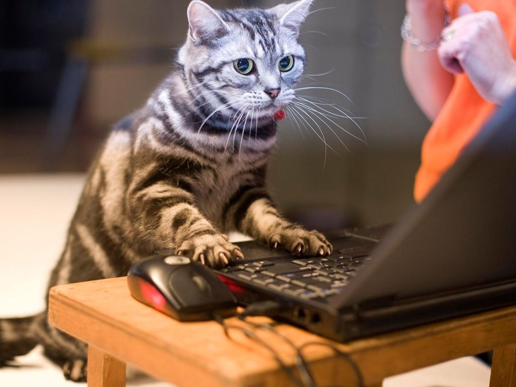
Vision 1: CONNECT KNOWLEDGE, PEOPLE, AND CATS.

This is the correct vision.

The Web erases the barrier of distance between people, and it puts all of human knowledge at our fingertips. It also allows us to look at still images and videos of millions of cats, basically all of it for free, from our homes or a small device we carry in our pocket.

No one person owns it, no one person controls it, you don’t need permission to use it. And the best part is, you are encouraged to contribute right back. You can post your own cat pictures.

Why is this not enough?

Connect knowledge, people, and cats

We live in a world now where not millions but billions of people work in rice fields, textile factories, where children grow up in appalling poverty. Of those billions, how many are the greatest minds of our time? How many deserve better than they get? What if instead of dreaming about changing the world with tomorrow’s technology, we used today’s technology and let the world change us? Why do we need to obsess on artificial intelligence, when we’re wasting so much natural intelligence?

When I talk about a hundred years of web design, I mean it as a challenge. There’s no law that says that things are guaranteed to keep getting better.

The web we have right now is beautiful. It shatters the tyranny of distance. It opens the libraries of the world to you. It gives you a way to bear witness to people half a world away, in your own words. It is full of cats. We built it by accident, yet already we’re taking it for granted. We should fight to keep it!

Read the whole thing, it’s excellent (and has more cat pictures than that one above).

Butterick’s Practical Typography

I just finished reading Butterick’s Practical Typography, an excellent online book that I found to be just the right depth. That is, it did more than just make fun of Comic Sans and Papyrus, but stayed well short of fancy stuff like setting margins based on the golden ratio. The word “practical” in the title isn’t misleading.

This book just scratches the surface of the huge subject of typefaces, and I doubt I’ll ever be able to tell Arial apart from Helvetica. But after reading it, I do feel like I have a slightly keener eye, and certainly more interest and appreciation for what makes fonts good or bad.

One of my favorite parts is the book’s advice about which standard, widely-available “system” fonts are better than others, as well as the lists of suggested alternatives, which are short and not overwhelming. Practical, you could say. In addition to his own custom-designed fonts, he also recommends some nice free ones, such as Charter (which you’re reading right now), Firefox’s Fira Sans, and Adobe’s Source Code Pro.

As the author says right up front, there’s a lot more to typography than fonts, and with confidence and casual style, he takes you through all of it. It’s a lot of information, but it’s engaging, interesting, and best of all, kept at the practical level. The book’s conciseness and organization also make it a valuable reference.

In fact I’ve already started using it as a reference, as it prompted me to make some typographic improvements to both this blog and the Unicks Bestiary. I almost hesitate to mention these “improvements”, as both sites would probably make a professional designer weep, but I do feel like they’re less bad than they were, at least. It’s fun stuff to tinker with, anyway.

The makeover he does on a sample résumé is a good glimpse at some of the book’s principles in action. And if you go on to read the rest of the book, be sure to pay for it. I did.

Internet Users Demand Less Interactivity

There are too many brilliant & hilarious Onion stories to retweet them all, let alone blog about them. But this one, a masterpiece of “it’s funny because it’s true”, deserves extra attention. Plus, it has too many great quotes for 140-character limits.

Without further ado: Internet Users Demand Less Interactivity.

Speaking with reporters, web users expressed a near unanimous desire to visit a website and simply look at it, for once, without having every aspect of the user interface tailored to a set of demographic information culled from their previous browsing history.

“I don’t want to take a moment to provide my feedback, open a free account, become part of a growing online community, or see what related links are available at various content partners.”

“I don’t want to know where other people are, I don’t want them to know where I am, and I definitely don’t want it all to be tracked by a website that pits us against each other to see who can share our locations the most. Frankly, it doesn’t make any sense why that would ever appeal to anyone.”

“Nobody needs to get my immediate take on everything I see online,” said Atlanta printing consultant Deirdre Levinson, questioning the merits of any site that, without knowing her level of intelligence or expertise in a particular topic, would deem her worthy enough to engage in a discussion. “And they’re sorely mistaken if they believe I could actually add something of value to the conversation.

If you’re thinking I’ve quoted the whole thing, you’re wrong. Read the whole thing. Learn it. Love it. Live it.

New! and… Improved?

Lucent Technologies logo Via Quipsologies, an interesting perspective on the advent of more and more people having opinions on logo and brand redesigns: Graphic Design Criticism as a Spectator Sport.

Redesigns such as Tropicana, UPS, and the University of California are used as examples. (Come to think of it, this isn’t all that recent a development; I was at AT&T when Lucent (RIP) was spun off, and their “Innovation Ring” logo was mocked by none other than Dilbert.)

The post gives an interesting, in-depth perspective, and is a reminder that people don’t necessarily love new designs just because they’re new and “better” according to the designers.

I was surprised by how often the civilians [non-designers] got it “wrong,” voting enthusiastically for the cartoony old version of the Comedy Central logo, the needlessly fussy and insecure pre-redesign Starbucks, the dated Clarissa Explains It All-era Nickelodeon splat. After a few hours of air-conditioned anthropological observation, a number of precepts emerged, almost all of which rang as true in my professional experience as in Building 110.

… Third, and most crucially, people prefer the thing they’re used to rather than whatever new thing you’re foisting on them.

This is unfortunately as true for software & user interfaces as it is for logos, though we can make those work better, be faster, do more, etc., in order to make it worthwhile for our users to endure the change.

I also loved this distillation of, well, of a lot of “discussion” on the Internet:

A seemingly endless series of drive-by shootings punctuated by the occasional lynch mob, conducted by anonymous people with the depth of barroom philosophers and the attention span of fruit flies.

As the saying goes: opinions are like assholes; everyone has one. When I first heard about the UC logo, I thought it looked dumb, too (though I was prejudiced by the Daring Fireball post that got me there). But there’s a lot more to it than a simple graphic that “a 4-year-old could have made”. Next time I have that reaction, I’ll remember this “Spectator Sport” post, as well as the UC logo post by Armin Vit he linked to, and think twice.

A logo doesn’t have to be the equivalent of a book trilogy and tell all its story through a circular device. A logo, actually, is nothing. It’s useless. It derives meaning from what it represents. I’ve said this before: The Nike swoosh logo is shit. It’s a clunky checkmark. People think it’s great but it’s not. It’s the amazing athletes and their stories that Nike has associated with over the decades. It’s the quality products. It’s the great ads. It’s not the logo.

… Funny story: You know what Nike founder Phil Knight said when he was presented (and proceeded to select) the swoosh logo? “I don’t love it. But it will grow on me.”

Microsoft’s World of Denial

This anecdote by Marco Arment of happening by a Microsoft store on Surface launch day is snooty and condescending, which makes me feel a little abashed that it resonates so much. On the other hand, I can appreciate how satisfying it is to long-time Apple users for the tables to be to turned on the old monopoly.

But I don’t think many Surface buyers are going to comparison-shop with the iPad, or vice versa. It’s very clear who the Surface is for, and it’s not us.

The Surface is partially for Microsoft’s world of denial: the world in which this store contains no elephants and Microsoft invented the silver store with the glass front and the glowing logo and blue shirts and white lanyards and these table layouts and the modern tablet and its magnetic power cable. In that world, this is a groundbreaking new tablet that you can finally use at work and leave your big creaky plastic Dell laptop behind when you go to the conference room to have a conference call on the starfish phone with all of the wires and dysfunctional communication.

But it’s also for people like that salesman who don’t agree with Apple’s choices: people who want to have more hardware options, more customization, more hackability, and fewer people saying “no” to what they can do on their devices.

Apple’s products say, “You can’t do that because we think it would suck.” Microsoft’s products say, “We’ll let you try to do anything on anything if you really want to, even if it sucks.”

That last bit is especially pertinent to me, with regard to design and feature decisions we’re making at work. Though all of us there admire and wish to emulate that spirit of Apple’s products, I think we have to admit that for our products, in our market, with our users, we’ll never be able to be that strict. (Of course, we’ll do our best to minimize the “even if it sucks” part.)

Powered by WordPress & Theme by Anders Norén