#roadpic


#roadpic

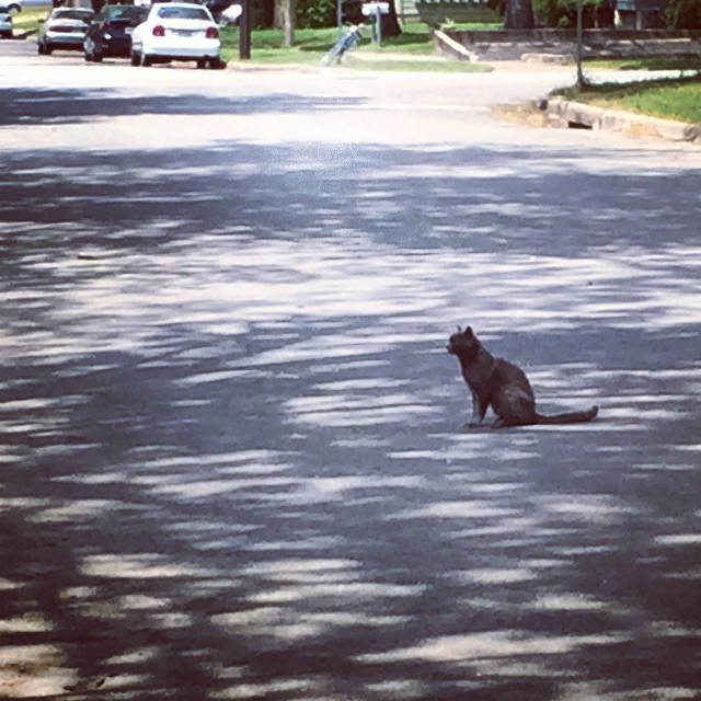
cat shape
a carload of food that would have gone in a Trader Joes’ dumpster, but for the work of @keepaustinfed

#clouds #nofilter #roadpic

#roadpic

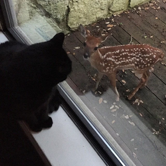
this fawn wasn’t at all impressed by our guard cat (!)
not found :-/
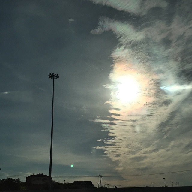
#clouds in a #roadpic, as #usual

#roadpic #clouds
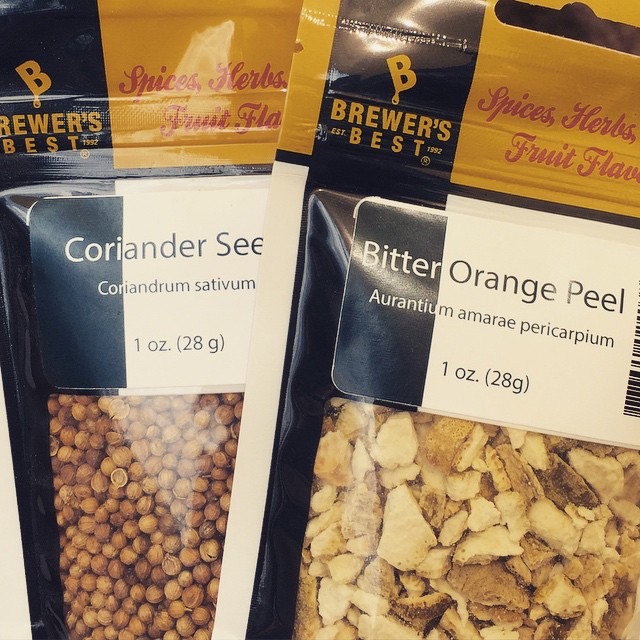
brewin’ Belgian wit’ @eberlysarmy
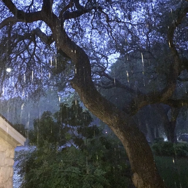
lightning flash, 9:30PM #nofilter
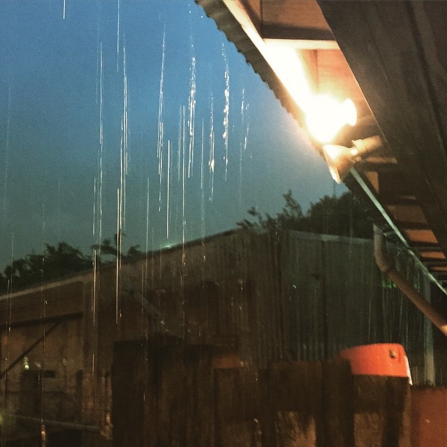
then the rain stopped & one of my all-time favorite bands came out & totally. rocked. \m/

rock & roll

hiding from the rain during the opener at the rain-or-shine Sleater-Kinney show ?
I just finished reading Butterick’s Practical Typography, an excellent online book that I found to be just the right depth. That is, it did more than just make fun of Comic Sans and Papyrus, but stayed well short of fancy stuff like setting margins based on the golden ratio. The word “practical” in the title isn’t misleading.
This book just scratches the surface of the huge subject of typefaces, and I doubt I’ll ever be able to tell Arial apart from Helvetica. But after reading it, I do feel like I have a slightly keener eye, and certainly more interest and appreciation for what makes fonts good or bad.
One of my favorite parts is the book’s advice about which standard, widely-available “system” fonts are better than others, as well as the lists of suggested alternatives, which are short and not overwhelming. Practical, you could say. In addition to his own custom-designed fonts, he also recommends some nice free ones, such as Charter (which you’re reading right now), Firefox’s Fira Sans, and Adobe’s Source Code Pro.
As the author says right up front, there’s a lot more to typography than fonts, and with confidence and casual style, he takes you through all of it. It’s a lot of information, but it’s engaging, interesting, and best of all, kept at the practical level. The book’s conciseness and organization also make it a valuable reference.
In fact I’ve already started using it as a reference, as it prompted me to make some typographic improvements to both this blog and the Unicks Bestiary. I almost hesitate to mention these “improvements”, as both sites would probably make a professional designer weep, but I do feel like they’re less bad than they were, at least. It’s fun stuff to tinker with, anyway.
The makeover he does on a sample résumé is a good glimpse at some of the book’s principles in action. And if you go on to read the rest of the book, be sure to pay for it. I did.
on the water, under the bridge

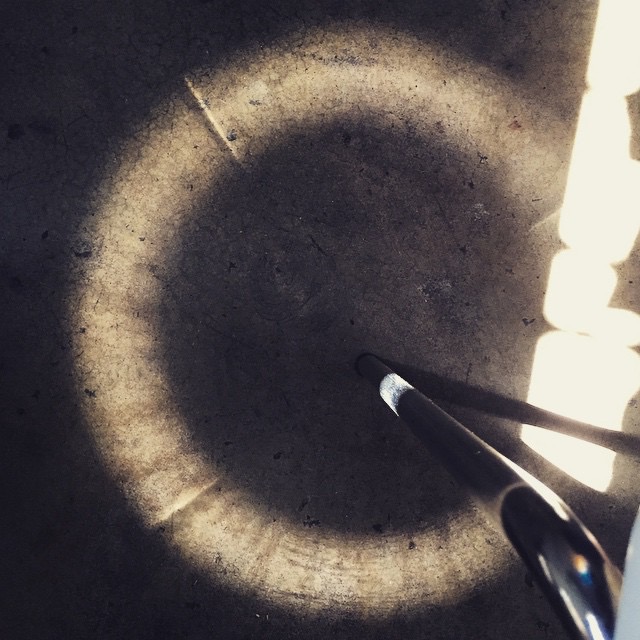
steel-chair-leg halo #steelchairleghalo
don’t tell anyone but I used my handheld device in the car #roadpic #nofilter

traffic jam
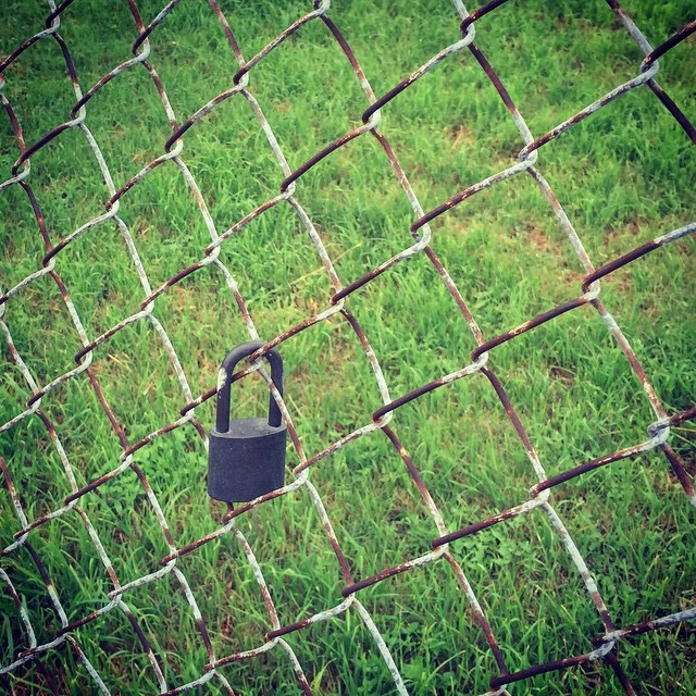
#lockpic
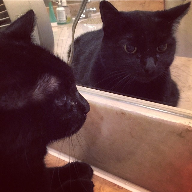
mirror cat
#nofilter #roadpic #clouds

#roadpic

gotta be a metaphor for something here

But more wonderful than the lore of old men and the lore of books is the secret lore of ocean. Blue, green, grey, white, or black; smooth, ruffled, or mountainous; that ocean is not silent. All my days have I watched it and listened to it, and I know it well. At first it told to me only the plain little tales of calm beaches and near ports, but with the years it grew more friendly and spoke of other things; of things more strange and more distant in space and in time. Sometimes at twilight the grey vapours of the horizon have parted to grant me glimpses of the ways beyond; and sometimes at night the deep waters of the sea have grown clear and phosphorescent, to grant me glimpses of the ways beneath. And these glimpses have been as often of the ways that were and the ways that might be, as of the ways that are; for ocean is more ancient than the mountains, and freighted with the memories and the dreams of Time.
— H. P. Lovecraft, The White Ship

everything’s better with a bluebonnet on it

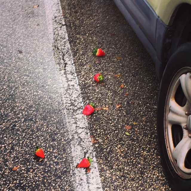
romantic trail and/or grocery accident at the HEB
there’s a dome/”Starship Pegasus” for sale in Italy, Texas #themoreyouknow


waiting to pick up daughter & her friends from seeing Panic! At The Rodeo

Powered by WordPress & Theme by Anders Norén